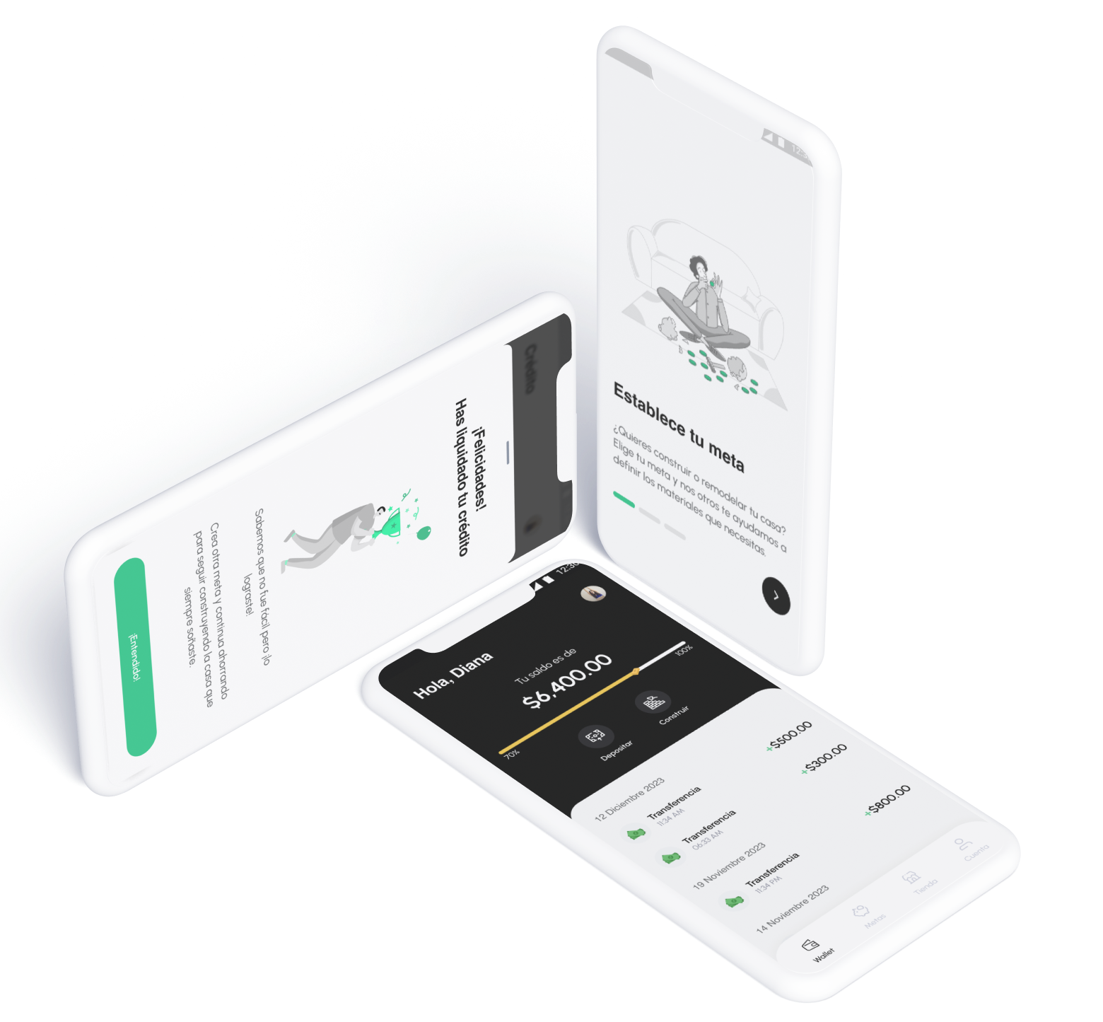
Constructoken is a Fintech Startup seeks to provide an alternative to bank financing for people who want to construct a home or renovate their current homes from any place in Mexico our the United States. And looking to provide a complete experience, they offer other services to their clients like location based automatic quotations (considering local prices), standard house plans, and attractive rewards to users who meet their goals.
Clients carry out each part of the construction independently, from making the plan of the construction, procuring materials, to supervising the work. To help users with this complicated process, it was necessary to know their needs in each part of the process and identify at which points Construtoken can help them in a way that is useful to users and gives them the value necessary to use it.
Understanding the process
To fully understand the problem areas around the auto production housing process, I carried out three different research tasks to collect as much information as possible. These were:
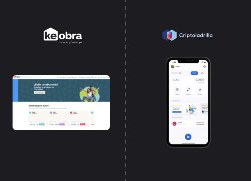
Desktop research of similar products or services in the market; we found three direct competitors: Construrama, Keobra, and Criptoladrillo.

Application of quantitative and qualitative surveys in 4 different cities in Mexico to identify goals and needs.
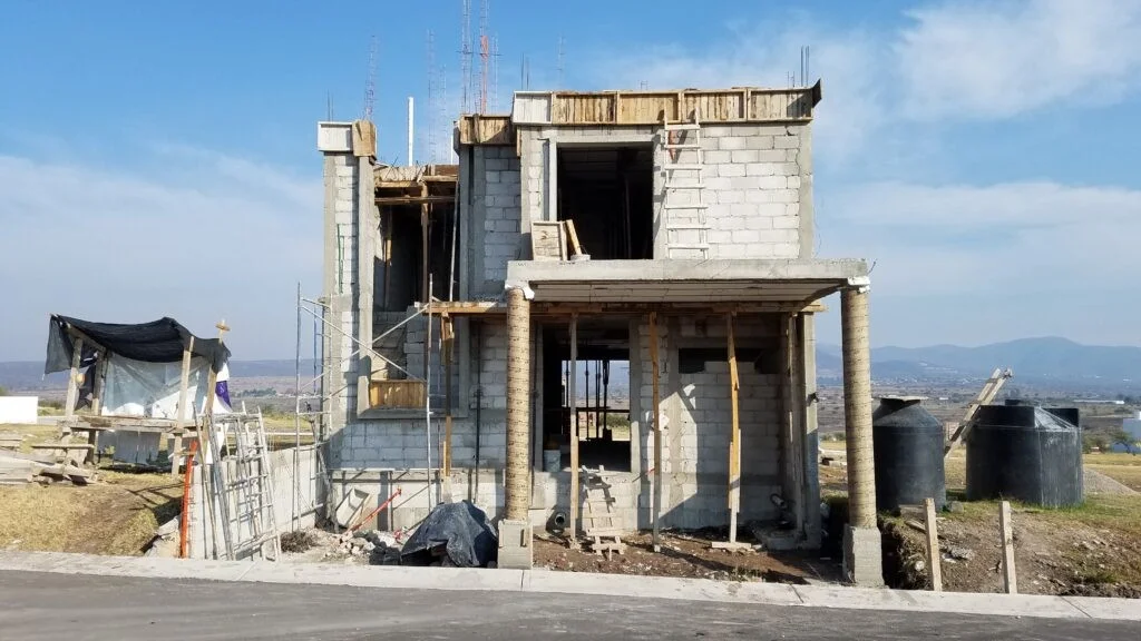
Contextual observation, identifying the pains and needs in each step of the autoconstruction process.
Generating Personas
After gleaning valuable insights from the 'understand' phase, plotting an affinity diagram and an empathy map, I formed two personas. These were created to help craft a better experience later down the line in the ideation stage.
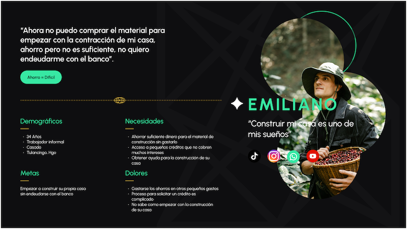
Emiliano is a user who wants to build his house but he doesn't have access to traditional bank financial products.
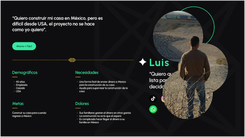
Luis lives in the United States and has been planning to build a house in Mexico for a long time, but finds it difficult to make much progress from the United States.
Definition & Ideation
After looking at data, analyzing user needs, creating personas to match these insights, and discussing business requirements, I moved on to the ideating stage. This was done in three parts:
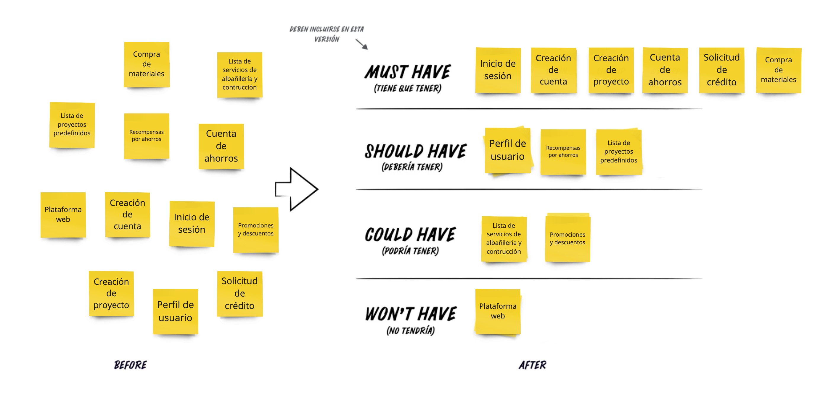
MoSCoW method
After working with the product and development team on a value proposition canvas and defining the user stories, I moved forward to prioritize the features with the MoSCoW method.
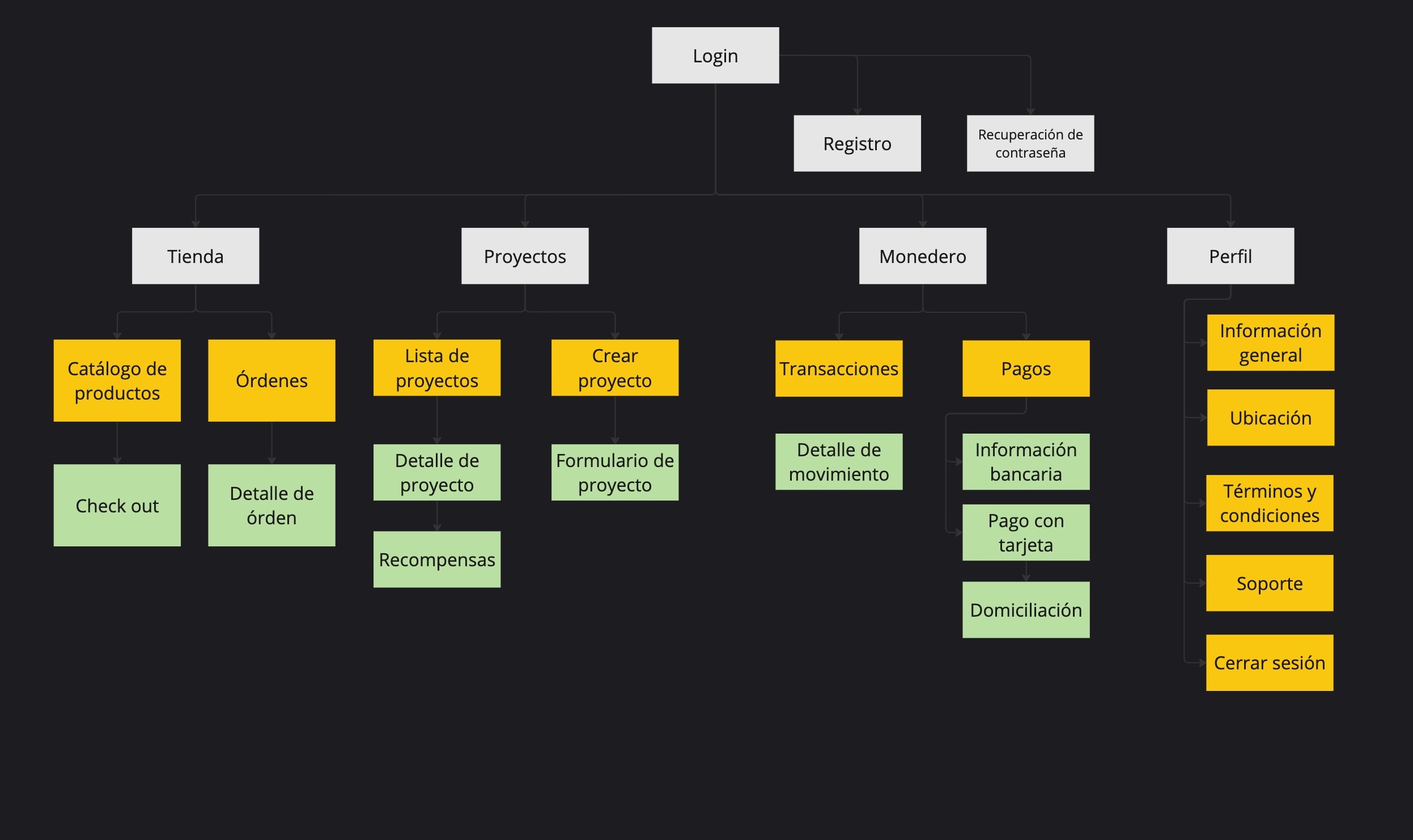
Site map
Having identify the prioritized features, I worked on the app architecture.
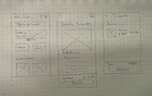
Sketching & User flow
I started with a sketching session to define the user flows in the app, including happy paths and unhappy paths.
Developing the idea
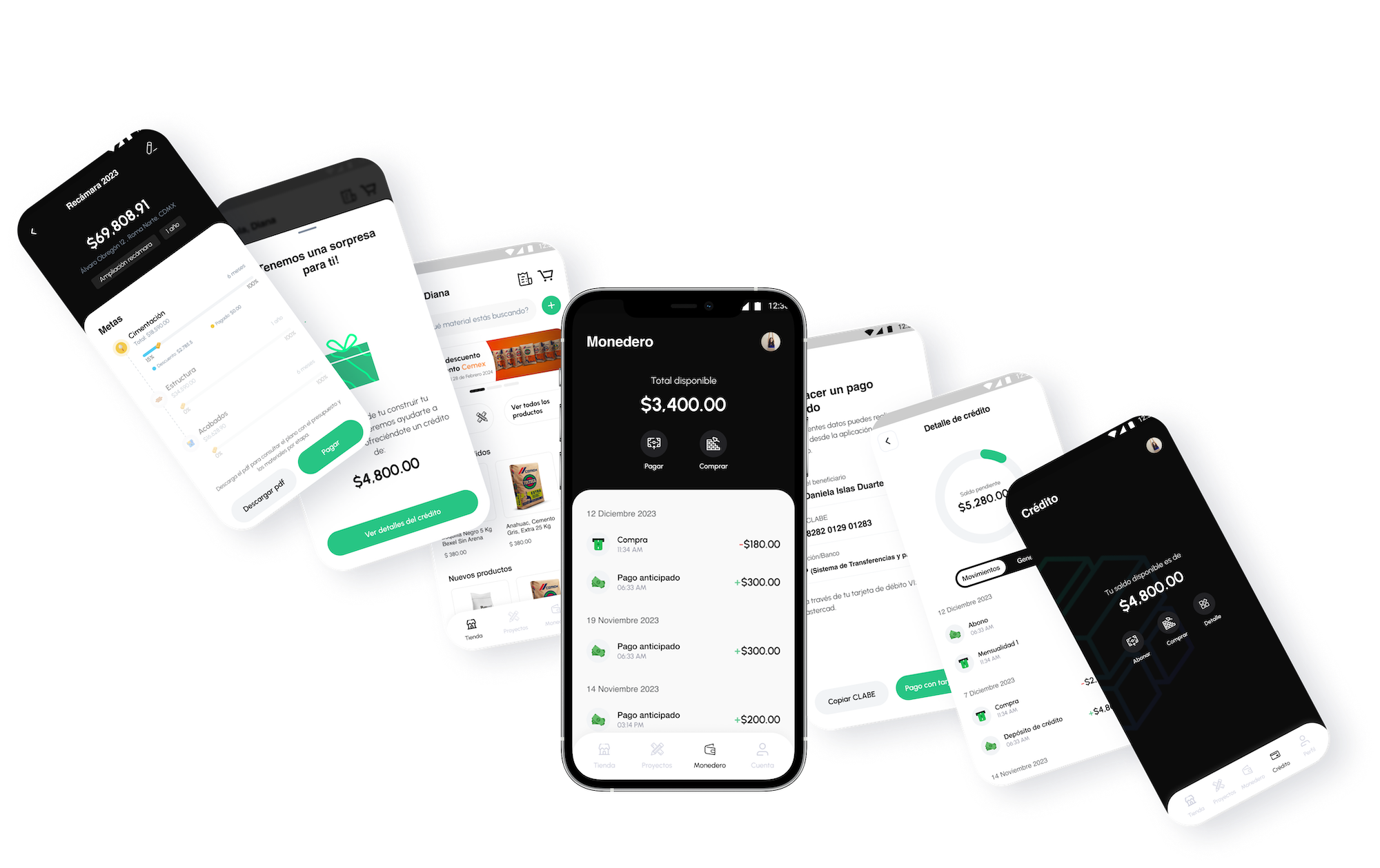
After ensuring that the user flows solve the users’ needs, I began working on a style guide based on the brand guidelines and then continued with the high-fidelity wireframes of both the application and the website.


Next Steps
Test the prototype with users and iterate on the design based on user feedback before taking it into development and then start with a beta test with 10 users to continue collecting feedback and iterating the design.

© 2022 Brenda González Ortega - All rights reserved.

