Projects ⇢ Covalto

Date
Junio 2020 - Junio 2022
Role
UX/UI Designer
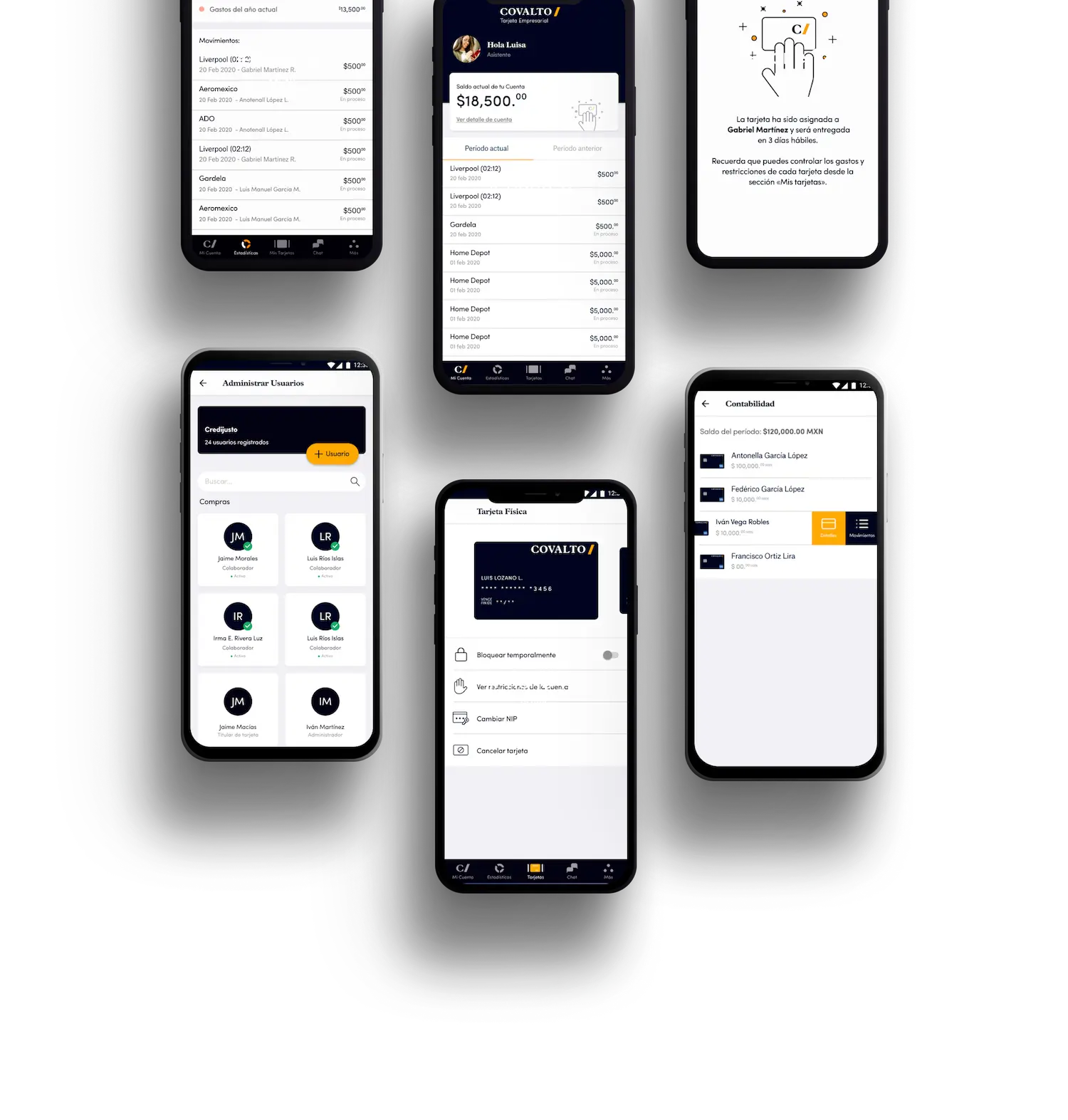
Covalto is a Bank that was born from the Credijusto acquisition of Banco Finterra. This new bank offers financial products such as personal and corporate loans, debit accounts, factoring and leasing services, and investment instruments. But, one of its main goals in 2022 was to launch a corporate credit card that would provide the best option to manage business expenses.
The challenge was to design a mobile application or web app that allowed companies to request a corporate expense account card that was 100% digital, where the users can request and assign expense cards for their employees, but be able to monitor and restrict approved expenses on each card.
Understanding the problem - User needs
To understand the user needs connected with the corporate credit card, I started with research that was composed by following:
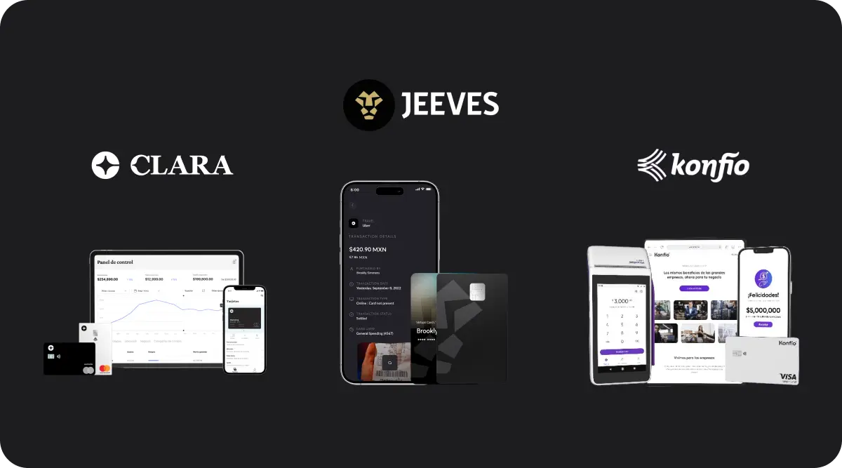
Benchmark
We identified 20 options in local and international markets with a similar offer. Then, we analyzed and compared these financial products.
Interviews
I conducted deep-dive interviews with 12 participants to understand the needs, pain points, and areas of opportunity around corporate credit card services.
User Personas & Journeymap
After gleaning valuable insights from the 'understand' phase, we created three user personas of which we will only focus on two.
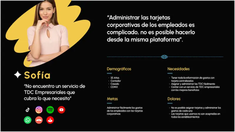
Sofia manages the company's cards and expenses and is the one who is responsible for limiting employee spending and justifying all company expenses.
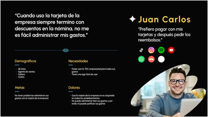
Juan Carlos uses the business card for his daily expenses as a sales agent, but he has difficulties managing his expenses and being able to pay with it.
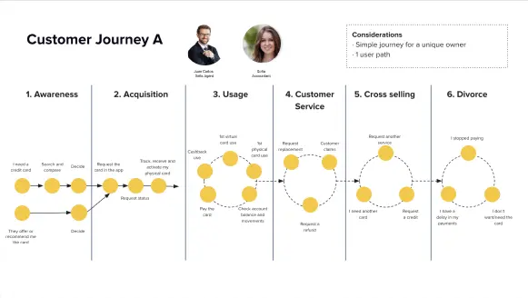
A customer journey map was created to map the process step by step, from the need for the business credit card to its use or cancellation.
What did data tell us?
Important findings from these surveys included:
- • 66% of users (companies) use business cards or prepaid employee living expense cards
- • 58% of companies use platforms that don't have card spending restriction options
- • Employees who use prepaid employee cards don't have an application to manage their expenses
- • 23% of users have problems paying with their TDC (they are not accepted in all establishments)


Definition
Working closely with the Product VP, we worked with each user type to define the features that the app must have to meet the business goals and the user's needs; therefore, improving their experience using business cards.*
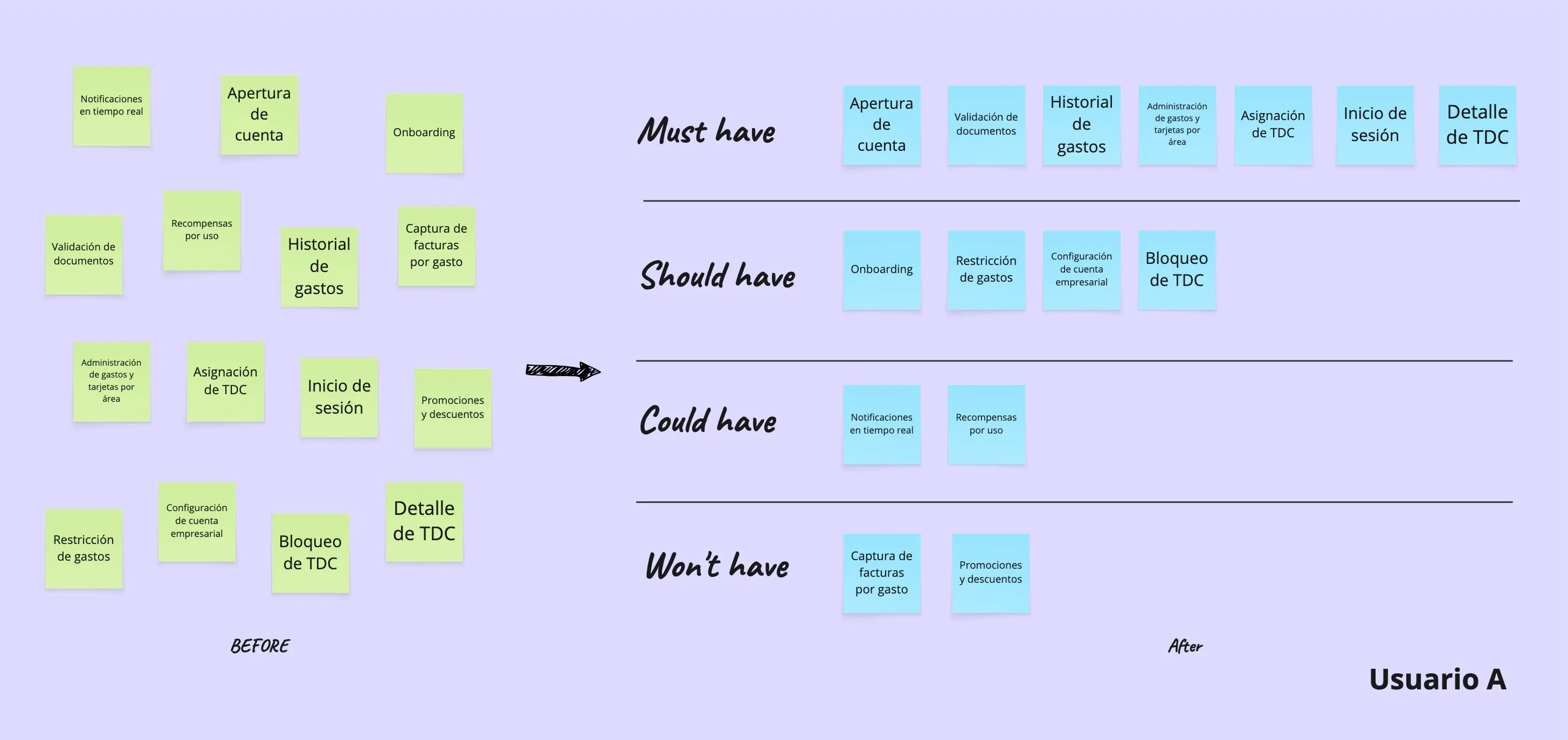
*Some details of the product and process have been changed or omitted for privacy reasons.
Ideation & Prototyping
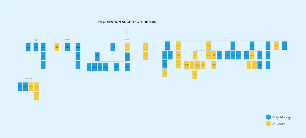
Site map
To ensure that content is found in the places where users expect to find it, I conducted an card sorting session with some users.
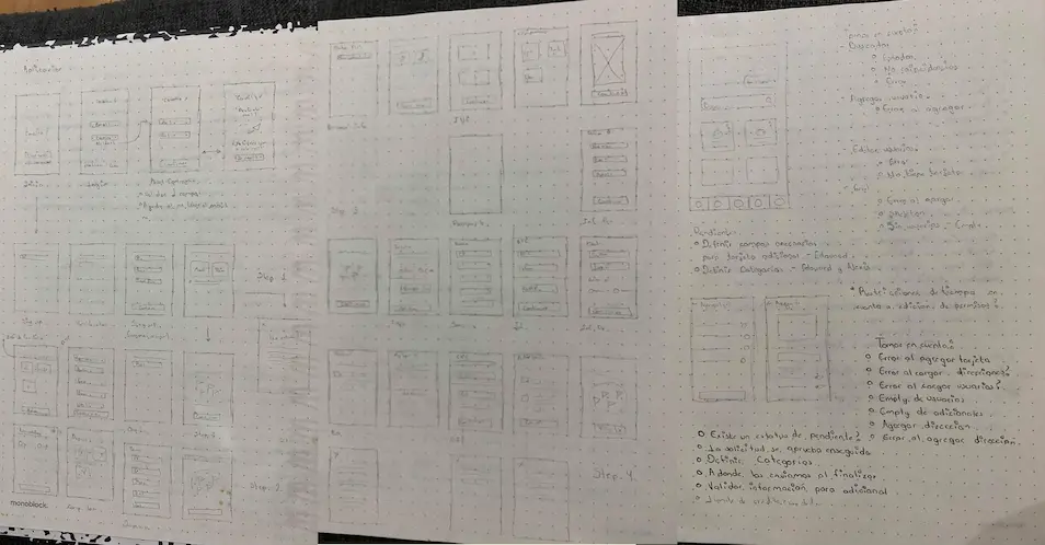
Wireframing
With the site map defined, I moved forward to design low-fidelity wireframes.
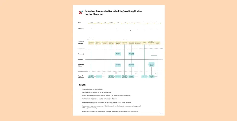
Blueprint
We identified some issues with the company document verification process, so I worked on a service blueprint to define the workflow.
Design
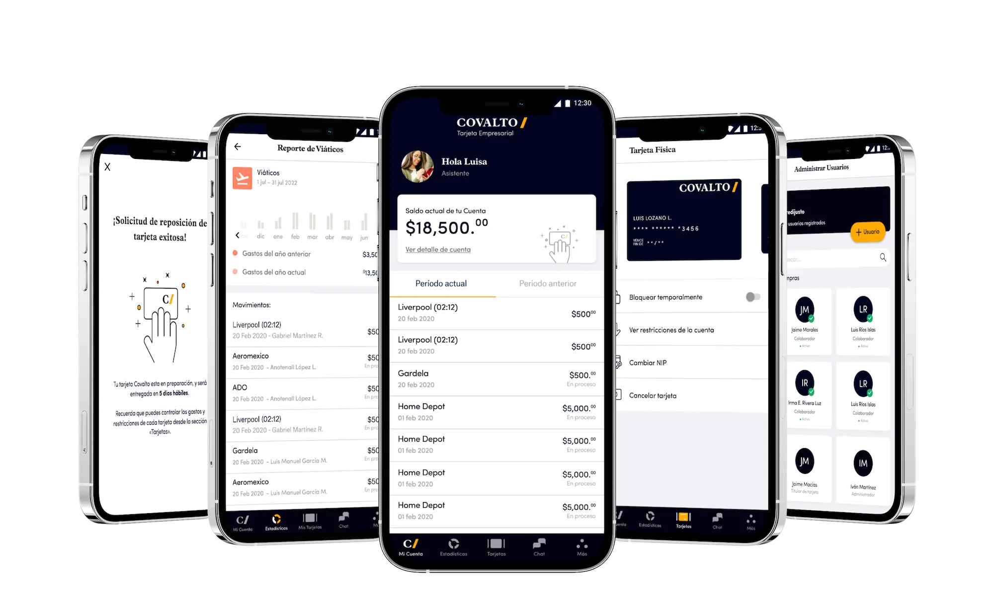
High fidelity wireframes
After reviewing the mid-fidelity wireframes with the product and development team, I continued with high-fidelity wireframes for IOS and Android.
Next steps
Continuing to iterate the app, a beta launch to test the app (experientially and functionally) with real users was scheduled for February 2022. Iterations continued after this testing cycle.

b
a
c
k
*
t
o
*
t
h
e
*
t
o
p
*